




This content was first published on IGR – Italian Gemological Review no. 5 in 2018. The information provided here is therefore current as of the original publication date.

Beauty, rarity and durability are the major attributes of a gemstone. Availability governs the (apparent) rarity and, therefore, can greatly influence the value of the gem. However, the value of a stone is also guided by additional factors. In 1982 Gemworld International introduced a system for grading colored stones that suggested trade appropriate terminology (i.e., Commercial, Good, Fine and Extra Fine). Although the system has been refined in the years since, its fundamentals have remained unchanged.
Color stone grading
The 4C’s are well established for describing diamond quality. But their application to colored stones is more variable. Color, clarity, cut and carat weight (size) are judged within a different context in colored gems than in diamonds making the assessment of their quality more subjective. Grading and pricing colored gems can be done using a similar system to the 4C’s of diamonds. That is to say, one can assess the color, clarity, and cut of colored gems in a systematic manner that allows for reliable grading and pricing in spite of the greater subjectivity found in color gemstones relative to diamonds. In this article, the author presents a basic overview of the GemGuide colored stone grading concepts. Hopefully the readers will gain some useful insights into accurate color communication and grading, which leads to more reliable pricing.
For virtually all colored stones, the primary value factor is the quality of their color. So much so, that certain color calls determine the varietal classification of a gem, i.e., ruby versus pink sapphire (after all, pink is simply a light tone of red). Yet these boundaries are often not well defined and can present significant problems for the trade.
Clarity is considered within the framework of the stone’s species and variety. This is done to account for differences in the formation environments for the various minerals. Case in point, it is extremely rare to find a naturally eye-clean emerald, whereas an amethyst is expected to be inclusion-free. Similarly, the size distribution (by carat weight) in the populations of differing colored stone species will vary. For example, while a 6 ct. emerald is considered to be large, blue topaz of this size is common.
Microscopy is essential to gemology, but in the context of evaluating clarity of colored gemstones, we consider the visual impact of clarity as measured by the trained, but unaided eye. The many varieties of gemstones range significantly in the degree and type of inclusions that are associated with each one of them. And since, the gem is ultimately viewed most often without the aid of magnification this seemed a reasonable approach.
Cut is the property that ties color, clarity and carat weight together. A skilled cutter brings out the best color in the rough gem and enhances its beauty with brilliance. Since the physical and optical properties vary from one species to another, there is no standard set of cut proportions for colored gems. Each piece of rough is unique. The cutter is ultimately balancing considerations of weight and quality when transforming a specific piece of rough into a faceted gem, while also considering the economic potential of the expected finished result.

The GemGuide ranks gems as commercial, good, fine, and extra fine. These categories may be further broken down for major gemstones as lower, middle, and upper commercial, lower and upper good, lower and upper fine, and lower and upper extra fine. Each of these terms correlates to a 1 to 10 numeric grade. While no grading system is universal, certain characteristics are generally understood to influence quality. Ranking gems aids in assessing the value. To correlate the grade with the GemGuide pricing system, the following scale is used.
Hue, value and chroma. Munsell notation
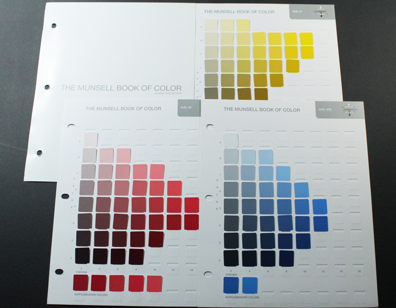
Gemworld International, in collaboration with Professional Gem Sciences, developed a color grading system based on Munsell, the universal standard. The World of Color is an easy to use color referencing system.
In Munsell, color is expressed in numeric notation. The World of Color system offers accurate color nomenclature adopted from the Inter-Society Color Council (ISCC) and the National Bureau of Standards (NBS) 31 charts of color names. These charts were developed to be used with the 40 Munsell hue pages. The charts offer standardized color nomenclature for each of the colors of Munsell. For example, where a particular blue sapphire might be graded 7.5B 6/12 in Munsell notation, the color chart identifies it as “vivid blue”.
Munsell Notation
Professor Munsell described color in terms of three attributes: hue, value and chroma which are separated into perceptually uniform and independent dimensions. He established numerical scales of equal visual steps for each of these attributes as he wanted to create a “rational way to describe colors”. The three scales are arranged in a three-dimensional space encompassing all colors.
The complete Munsell notation for a chromatic color is coded as H V/C where H is the hue, V is the value and C is the chroma. Therefore, the color of any object can be described by Munsell notations under controlled viewing conditions. For example, an extra fine quality emerald with an assigned hue of 5G, a value of 5, and a chroma of 14, would have the complete notation of 5G 5/14.

Hue: The Munsell hue notation of a color indicates its position on a visually uniform scale of 100 units arranged in a circle. Professor Munsell chose to use five “principle” hues of red (R), yellow (Y), green (G), blue (B) and purple (P) as well as five intermediate hues; yellow-red (YR), green-yellow (GY), blue-green (BG), purple-blue (PB) and red-purple (RP). For simplicity, he used the initials as symbols to designate the different hue sectors. Munsell assigned ten units to each of these ten hue sectors, creating a 100 unit, hue circle. Hue may be identified by a number from 1 to 100. However, the meaning is more obvious if the hue is identified by the hue sector and the step, on a scale of ten, within that sector. The current edition of the Munsell book contains four hue samples in each of the ten hue sectors at the positions 2.5, 5, 7.5 and 10. Also included in certain sectors, at high chromas greater than 12, are samples at the 1.25, 3.75, 6.25, and the 8.75 step positions. There are 22 of these intermediate hue position samples to complement the 40 standard hue position samples.
Value: Value indicates tone; the lightness or darkness of a color. The Munsell value notation of a color is measured on a vertical scale ranging from 0 to 10, and the Munsell book gives color samples at the 9, 8.5 (for yellow hues only) 8, 7, 6, 5, 4, 3, and 2 step levels. Neutral grays position between absolute black (0) and pure white (10). So, “Value” is equivalent to what is referred to as “Tone” in the GIA colored stone grading course.
Chroma: Chroma is the degree of saturation (purity), or brightness or dullness, of a color. The Munsell chroma notation is measured on a horizontal scale which extends outward, starting from 0 at the central neutral core, with no designated end. The Munsell book has samples at the 1, 2, 4, 6, 8, 10, 12, 14 and 16 positions for certain hues and values. In the Munsell color space, the further one moves on this arbitrary, visually uniform scale, perpendicularly away from the central neutral core, the more saturated or bright a color becomes. So, “Chroma” is equivalent to what is referred to as “Saturation” in the GIA colored stone grading course.

Color Grading Environment
Color grading of gemstones is an observer-based activity. As such, it is most reliable when the observer can operate in an environment that has consistent and controlled viewing conditions. The observed color of a surface depends on the nature of light, spectral quality of the illumination, the direction of illumination, the direction of viewing, the surround or background, and the nature and state of adaptation of the eyes of the observer.
All significant color observation should be made under standard conditions of illumination. Indirect northern daylight or standard artificial daylight provides the optimum. The color spectrum of the light emitted by a source can be measured in terms of its absolute temperature on the Kelvin scale. The World of Color system is developed and tested under a well-balanced light with a color temperature of 6500°K (Kelvin), which closely approximates that of average, north-sky daylight. The use of standard fluorescent tubes which emit light having a color temperature of 6200°K or higher is sufficient. The standard diamond grading light has a warmer color temperature and the UV content might be higher.

The grader should view the sample gemstone and the color standards perpendicularly, at an angle of 90˚ to the stone’s table facet, while the light should fall upon them at an angle of 45˚. This viewing geometry may be reversed if necessary. However, for gemstones, the first viewing position also presents the observer with the stone’s brilliance. The stone should be looked at in several positions and rocked back and forth through an angle of about 30˚to 45˚ from the perpendicular viewpoint to fully assess its brilliance.
Assigning a World of Color notation to a transparent gemstone
The color of a transparent, faceted gemstone is very complex. In fact, the gem professionals might find it difficult to compare the vibrant color of a transparent gemstone to the opaque color ovals printed in the World of Color System. However, practicing with the transparent gem crown specifically designed to be used for the World of Color System and repeating the process with a few known samples will prove that the system is consistent and reliable.
A gemstone reflects light in various degrees of luster from sub-vitreous to adamantine. It might disperse the light into spectral colors (fire) depending on its identity. The refraction of light within a gemstone is also controlled by its cut quality and proportions.
For faceted stones, when viewed perpendicularly to the table facet, the light that is reflected and refracted back to the observer is called brilliance, and is a good place to begin in describing a gemstone’s color. This is the color seen reflected in the pavilion facets when viewed through the crown of the gemstone. This color should be assessed by comparing it to the WOC system, assigning it a Munsell color notation and estimating its cumulative area to the total surface area of the stone, as a percentage.

If the stone displays a significant portion of body color, or if it has a significant “window” where light passes right through it, these resulting colors should also be assessed as to notation and estimated area. Finally, the amount of any significant dark area or extinction should be assessed by estimation of its cumulative area compared to the total surface area of the gemstone. When all of the percentages of these different color portions are added together they should total close to 100% and should be a good representation of the complete color presented by the gemstone to an observer.
Many stones which are well cut will have only one major portion of brilliant, reflected color and can be assigned a single-color notation. But many others will have several portions of different colors and these should all be assessed to provide the most complete and accurate description of the stone’s face-up color appearance.
Like any tool, the final grade must be made by the objective call of the experienced gem grader or appraiser. Using the available tools, the grader can confidently approach the task of color grading.
Article by Stuart Robertson*, published on IGR – Italian Gemological Review #5, Autumn 2018.
*Stuart Robertson is the vice president and research director for Gemworld International based in Glenview, Illinois USA. Gemworld is a market research company and publisher of the wholesale gem pricing report, Gemguide.


